Button: Difference between revisions
Appearance
Created page with "{{Infobox component | title = Button | id = MHG.Button | caption = Button | configurable = 1 | io.minInputs = 0 | io.maxInputs = 0 | io.outputs = 1 }} The '''Button''' is a component used for accepting the player's input. It can be pressed by left-clicking on it. == Behavior == For as long as the player holds down left-click on the Button, its output will be {{on}}. When nobody is clicking on the Button, its output will be..." |
(No difference)
|
Revision as of 03:23, 9 September 2025
 Button | |
| Component info | |
|---|---|
| Internal ID |
MHG.Button |
| Configurable | Yes |
| Input and output | |
| Input count | 0 |
| Output count | 1 |
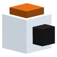
The Button is a component used for accepting the player's input. It can be pressed by left-clicking on it.
Behavior
For as long as the player holds down left-click on the Button, its output will be ON. When nobody is clicking on the Button, its output will be OFF.
Configurability
The Button can be edited to change the color of the pressable part.
Placement
The Button can be placed in the center of a Circuit Board square or on top of a Mount, and can be fine-rotated.

