Panel Label: Difference between revisions
Appearance
Created page with "{{Infobox component | title = Panel Label | id = MHG.PanelLabel | caption = Panel Label | configurable = 1 }} The '''Panel Label''' is a variant of the Label that is shorter. It matches the height of panel input components like the Panel Button and Panel Switch, so it is often used to label the function of these input components. == Behavior == The Label displays text. == Configurability == The Panel Label can be Edit Component Menu|..." |
add stub template |
||
| Line 1: | Line 1: | ||
{{stub}} | |||
{{Infobox component | {{Infobox component | ||
| title = Panel Label | | title = Panel Label | ||
Revision as of 04:45, 9 September 2025
 Panel Label | |
| Component info | |
|---|---|
| Internal ID |
MHG.PanelLabel |
| Configurable | Yes |
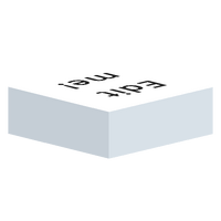
The Panel Label is a variant of the Label that is shorter. It matches the height of panel input components like the Panel Button and Panel Switch, so it is often used to label the function of these input components.
Behavior
The Label displays text.
Configurability
The Panel Label can be edited to change the text, as well as the text style, size and alignment.
The Panel Label can also be resized to have a bigger footprint.
Placement

